Airtame Cloud Redesign
A complete redesign of Airtame’s management desktop platform for devices.
Challenge
How might we create a satisfying experience that makes finding, selecting and managing devices feel quick, intuitive and efficient?
Role
Product Design, Design System, Prototyping, Usability Testing
Year
2021 - 2022

Context
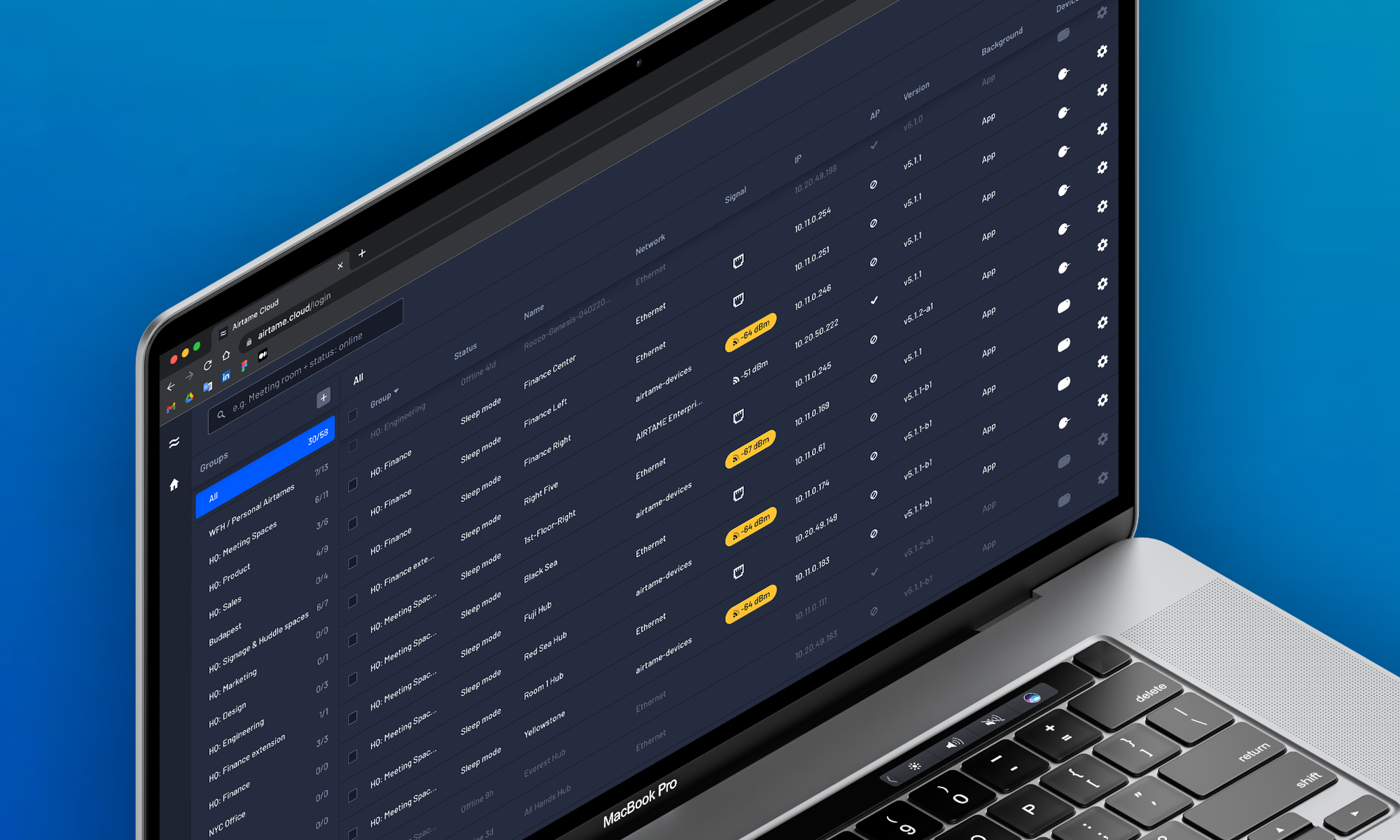
Airtame offers a wireless presentation solution for business and educational institutions: hybrid conferencing, screen sharing, & digital signage, all in a single platform. Airtame Cloud is a web based application that allows users to manage, monitor and control their Airtame devices and screens from anywhere. You can either see a list of devices with more precise information and data, or you can opt for a more visual overview, and just see what’s on display on each screen in real time.
Defining the problem
Airtame Cloud offers an overview of all the devices in the same organisation, where you can create different groups to better organise them. This is the main screen of Cloud, and we call it Device List. Some organisations, like big schools in the US, have hundreds (sometimes thousands) of devices and Airtame Cloud was not prepare for these big rollouts. Some users were experiencing delays when loading the device list, and managing groups wasn’t really intuitive. Search for a specific device/s to edit was challenging, and on the UI some of the information was being hidden.
Technically speaking we were having a performance issue, as the frontend rendering of the devices list contained two layers of rendering: the first displaying the full list of groups, and the second with the respective devices per group.

Before

After
Discovery
We unearthed useful insights through user feedback, usage data, and user research. We had a workshop where with the PM, the Cloud Team Lead, the Product Design Lead and myself (Digital Product Designer), we discussed the assumptions we had, and we ended up with many issues identified. Some of the them stood out as clear problems for users and the business:
- Finding a device is not easy or efficient, and Searching is not user friendly.
- Information is most of the time hidden, and these details are crucial to make the user confident that they are editing the right device/s.
- It's hard to manage when there is a large amount of devices.
- The Cloud UI is not really intuitive.
- From a technical standpoint we were experiencing performance issues.
- Speaking from the UX side of things, we wanted to use patterns that felt familiar and intuitive to the user.

Insights from the workshop

Hypotheses derived from the insights
Ideation
From the technical side, render one layer at a time would solve the performance issues. So having this in mind, how can we present a solution to the user, that would feel intuitive and friendly? We knew we could achieved this by following patterns that felt familiar for the user, instead of trying to “reinvent the wheel”.
We were introducing another layer, the group list layer, converting the Cloud into a three-level menu interface, and this common pattern is well known on dashboards and desktop applications. This type of navigation often needs a bit of help with speed, that’s why nailing the optimal layout is super important. After doing some research around best practices on these kind of navigations and gathering some inspiration from well known interfaces, we decided to add this extra layer on the left side of the menu.
We achieved this by splitting the list of devices and giving the groups their own navigation and place in the UI, in order to better organise the devices and to allow the user to only focus on the group they want to, and not on everything else.
We also decided to add simple and intuitive gestures, such and drag and drop, to enable the user to organise groups as they want, having what they prefer higher on the list.


Validation
We worked closely together with the User Research Lead, and we reached out to some of our users and invited them to participate on qualitative interviews, where we let them interact with the prototype while we observed. We asked them to think out loud, and if they see any difference, and for our surprise most of them didn’t. They just started using and interacting with the prototype without hesitating. Users didn’t notice the change, they used it exactly as we intended to. We asked them to do simple but everyday tasks, like find a device, a group, and select one and multiple devices.
Final thoughts
This was the biggest change since Airtame Cloud made its first appearance. The project was a huge team effort, where we joined developer and design forces.
Saying this, it was a big challenge and the pressure to make it right was present. The users never noticed a change, and just started experiencing the Cloud as we intended. Thanks to that we learned the power of making things intuitive and familiar for the users. I truly learn the meaning behind “good design is invisible”.