Airtame UI Design System
Project leader, shipping multiple components, building documentation and improving collaboration between designers and developers.
Challenge
How might we improve the collaboration between developers and designers, making sure we deliver faster while maintaining consistency?
Role
Product Design, Design System, Project manager
Year
2022
Context
Airtame offers hybrid conferencing, screen sharing, & digital signage. This means that there’s plenty of opportunities for inconsistency between the product offerings. The desktop application for screen sharing and conferencing, and the Airtame Cloud web app for managing devices, were existing with individual teams creating their own UI elements, developing components and following different patterns.


Defining the problem
When I joined the company back in 2020, we had design tokens in place and a few basic components, like buttons, selectors and some icons. So far the Airtame UI library was something to do on the side when we run out of tasks.
The idea was there, and in the Product Design team we all wanted to have our own design system. We just needed to convince the correct stakeholders in order to treat this a proper project on its own and get resources to work on it.
The base was pretty good, but we encountered a couple of issues:
- Visual inconsistencies across the app and the Cloud
- Duplication of components
- Fragmented workflows and processes
- No streamlined communication
- Inconsistent brand experiences and patterns across the products
- Too much time and resources spent in redoing and building custom components each time we needed to add something new
- A lot of legacy code and components

What we did
We built an Airtame UI force: our amazing Product Design team lead helping with the strategy, myself leading and managing the project, our two talented designers and two other really skilled developers.
We started by gathering and reviewing everything that we already had in place, we documented, organised and ended up with a clear idea of the state of things and how much needed to be done.
We established processes and workflows that we were missing, we streamlined the communication in one channel, and we also started sharing what we’re doing to the company. I created a Jira workflow and board for the project, we had workshops and many iterations until we found out what worked for us. We gave the project identity, we involved people and by making all this process more visible, we managed to engage even more people in it and get them excited about it.
We also defined goals and metrics in order to measure our progress:
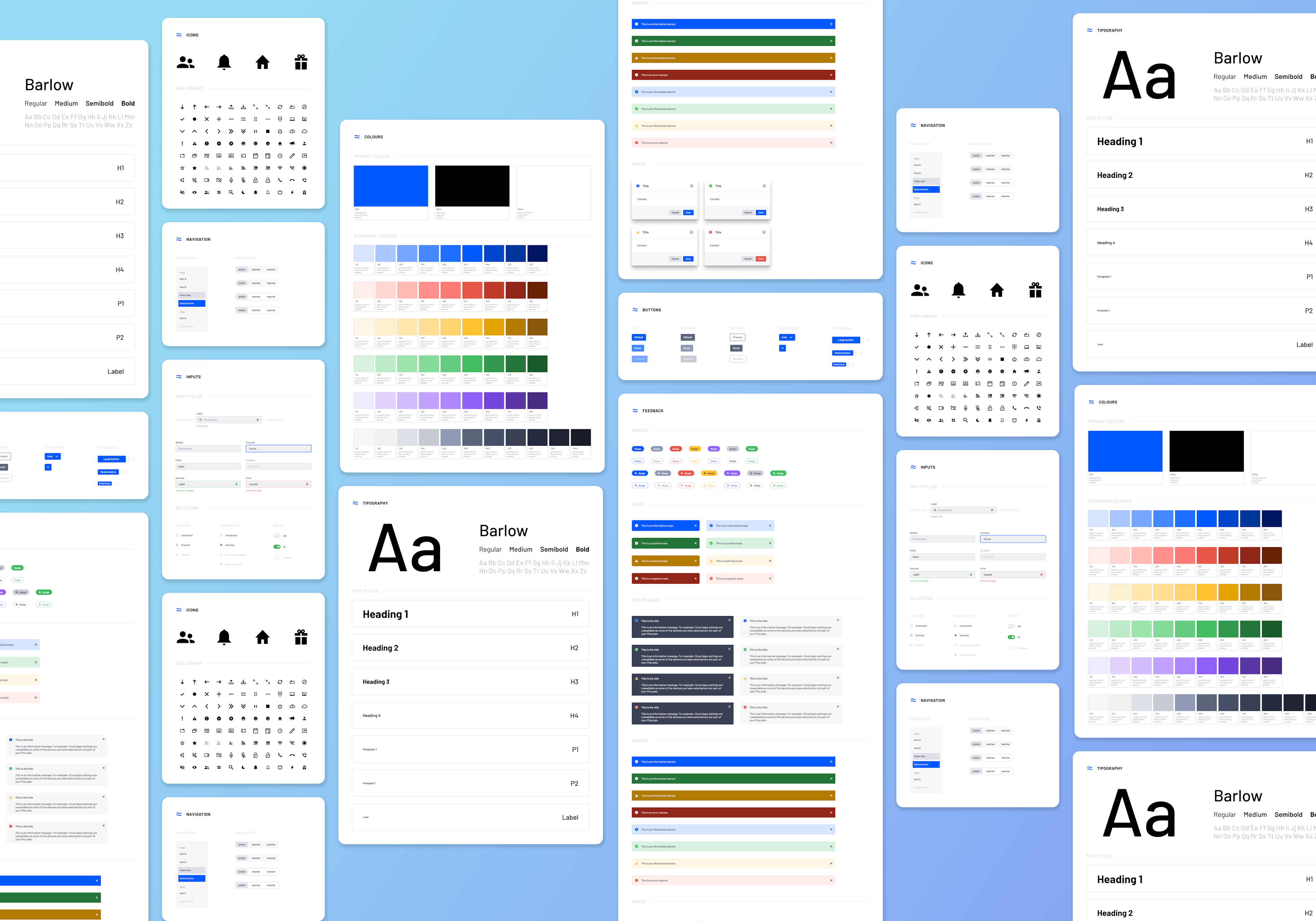
- We wanted to have at least 80% of what we had on Figma, also on Storybook by the end of the year. We estimated from 6to 8 months to complete this, we did it in only 3!
- For every component, we wanted to have all the needed and basic variants: size, state, type and theme.
- Have a description for every component, and a well organised overview of the variants in it (thanks to great Figma plugins!)
- Reduce the amount of text variants, to the only ones we really use

New Jira workflow

What we ended up with
- A design system with the components we use and need, and that’s constantly evolving
- Components that are flexible enough to give designer the freedom to do what they do best, whilst keeping consistency
- Less and less legacy code
- Airtame UI being praised and celebrated in retrospectives
- Less time on Figma, more time thinking, researching and solving
- Less time coding, more reusing
- Documentation on Notion that’s up to date and well maintained, where you can find our design principles, descriptions, guidelines, best practices, patterns we use and how we work on our design system.
- An icon library that represents the brand and feels “Airtamey”, even in the smallest of sizes
- A place for all communication related to the project, where we not only ask for variants, but where we celebrate every update release
- Happy devs, happy designers, and happy PMs :)

Final thoughts
This was (and still is) a huge success story. We have many ambassadors and fans of Airtame UI in the company, and people are excited to know more about it and get to use it. Even the hardware team is using our icons!
I also learned that a Design System is never done, is not something you can check as completed. It’s a living thing, that you need to take care and that’s always evolving and changing. And that’s ok.